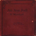
An Axe Fell
Posted: Tuesday, July 20, 2004
By: Steve Saville
 Creator(s): Brian Musikoff
Publishers: Self Published
From: Unknown
Price: 1.25
A tiny wee gem this one. A palm sized comic containing 16 single frame pages that combine in what is basically an extended metaphor. The story of the Titanic is used to express the earth shattering effect of being made redundant from your job. The assumption is that it is strongly autobiographical.
The pictures chart the tale of the ill-fated maiden voyage of the Titanic while the words tell the story of the effects on the narrator of being made redundant from his job. The connection between these two strands is cleverly executed. The whole point that Musikoff is making is that, for an individual, to be suddenly made redundant, cast adrift by the company that you had loyally served is a personal tragedy on the scale that the sinking of the Titanic has in modern history.
So the story has a positive opening as the narrator works his way up the ladder of employment success within his nameless company and this is mirrored by the optimism evident amongst the passengers at the launching of the Titanic.
It is this close and sustained connection between the visual and verbal elements that makes this comic memorable. The naivety of the narrator revelling in his promotions is compared to the naivety of the passengers sipping wine on the Titanic. The narrator is tossed “into the freezing black sea of unemployment” and is then rescued by some friends in a lifeboat who offer him a small job in a coffee shop.
The overall effect is to capture just how traumatic redundancy can be. Yep you guessed it this comic has a strong mid life crisis feel about it It is the heavy use of symbolism that somehow sets it apart though. This starts on the cover with the simple picture of a life saving ring and is sustained throughout. The most powerful use of symbolism however is the one page that breaks from the Titanic story. Two simple vertical rectangles, some smoke and the word “boom”. The simplest picture in the comic but instantly recognisable as the twin towers tragedy. It is a sobering reminder of just how iconographic this image has become.
Yes this comic is clever and well drawn but it also bleak and overtly symbolic and this is carried through to the choice of colour. The muted greys that are used to colour the characters portrays them as somehow lacking life, this morbidity is sustained through to the pessimistic closing page. It is a haunting tale, I found myself ruminating on it as I walked my dog in the mornings, it had an unsettling effect on me.
Jeez Brian, I hope things have improved over the last couple of months.
In a Word: Metaphorical.
If you have a comment or question about Small Press then feel free to contact me