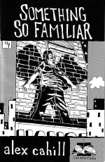
Something So Familiar
Posted: Tuesday, December 6, 2005
By: Steve Saville
 Creator(s): Alex Cahill (Self Published)
Publishers: The New Radio
From: USA
Price: $4(US)
The most immediately noticeable aspect of this modern day tale of urban angst is the complete absence of words. I believe the term used to describe silent comics is "Pantomime Graphic Novels"... whatever, all I know is that it is quite a big ask to sustain a 45 page comic without dialogue.
Comics are all about the combination of the visual and the verbal, that's what comics are, well not originally maybe, but modern comics sure as heck are. So Alex Cahill is taking quite a risk here. I mean minimal dialogue in comics is quite trendy right now [thank you Mr Ware] but no dialogue, well the art had better be pretty sharp that's all I can say.
Something So Familiar is a tale of a middle aged married man who has his life turned upside down when his wife and son leave him. His life might have been mundane before but at least it was something. The departure of his family signals the beginning of a series of events that combine to bring the walls of his existence crashing down around him.
As the story unfolds the line between his urban everyday reality and the nightmarish world of his dreams becomes increasingly blurred until his eventual decision seems almost logical and believable. Our confusion between reality and fantasy is not important because the comic is primarily concerned with the dislocation and despair of the main character, our confusion therefore matches his.
The restrictions of the protagonist's world are enhanced by Cahill's decisions regarding page layout. It would be reasonable to expect that in a comic that has discarded words then the artistic experimentation would grow to fill the spaces. So it is initially surprising that Cahill has chosen a very uniform and repetitive page format. Almost every page is made up of six squares. The effect of this is to enhance the claustrophobic feel of life in an inner city American apartment block. This almost overpowering sense is further emphasised by the number of frames that contain nothing more than an exterior view of the apartment block that houses the main character [12 of the first 23 frames to be precise].
Artistically two further things stand out. Firstly Cahill's bold portrayal of his characters, his ability to employ a bold style to show subtle changes in mood and emotion is particularly effective. The second, related, feature is Cahill's use of black and how the bold use of black is used to create stark and arresting contrast. As the main character is plunged further into personal despair so the use of black is increased. To the extent of one page in particular that consists of nothing more than six black frames. As the oppressive ‘blackness’ grows so does Cahill's use of close up and obtuse angles. The descent into confusion and despair is carefully paced and controlled.
This does not mean that all is delivered with a heavy hand. Cahill is capable of some extremely effective subtleties. The appearance of light stubble on the main characters chin symbolises so much more than words ever could. The fact that his number plate is "#1 Dad" is so pathetically tragic that is wrenches at the gut as does the frame that shows his wife's pillow that has obviously not been slept on, the sense of loss hits like a punch.
Yes this is a tragic tale but it is neither sentimental nor judgemental. It does manage to capture the confusion of a man struggling to cope when he is suddenly made to feel redundant in all aspects of his life. Ultimately it is not comfortable or comforting but it was not intended to be. And yes the art is sharp.
In a Word: Dislocating .
If you have a comment or question about Small Press then feel free to contact me