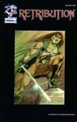
Retribution
Posted: Tuesday, June 6, 2006
By: Steve Saville
 Creator(s): Vin Varvar and Mike Phillips
Publishers: Creative Elamentz (Self Published)
From: USA
Price: $4.95(US)
One hundred and twenty eight pages of graphic novel for $4.95 now that has got to be value for money.
The basic storyline is promising as well, I mean a tale of voodoo and revenge set in the sinister and shadowy world of New Orleans. Dark magic, zombie armies from hell and standing against them the heroic figure of Retribution [the metaphorical name of the main character’s alter ego].
OK so he look a little like a cross between Gene Simmons in full make up and Beetlejuice but that’s OK, he is fighting the hordes of hell after all so he’s got to look the part.
What we have here is a tale of a violent, if reluctant, vigilante figure as he sets about gaining revenge on those who nearly succeeded in turning him into a zombie. He is driven by the desire to stop others from the horrific situation that he has yet to fully recover from.
I found it difficult to relate or sympathise with this mysterious figure until some background was provided. In fact it was this filling in of past events that saved this comic just when my concentration was starting to wander. It is only when the masked and caped Retribution is revealed as Ashe Hunter a "down on his luck" recent arrive in New Orleans that the story starts to have some depth.
This is the first instalment in what is obviously an ambitious project and it has a good deal going for it. In particular I like the way that it rises above most zombie comics in that rather than concentrate on a gross out fest the creators have actually taken the time to research the world of voodoo. As a result the created world presented here is given an air of credibility through the use of correct voodoo related terminology.
Another positive feature is the often effective use of contrast, blocks of heavy black and silhouette all of which help create a world of dark foreboding. It is a shame that so much of this atmosphere is destroyed by having pages that all too often contain just too much empty white space. The overall effect is very Spartan not the most appropriate for a story set in a crowded urban environment. The most effective pages are the ones that make the most extensive use of contrast. Overall then a little more care in page design would have improved some of the less impressive pages.
Another criticism I have is the sometimes random approach to proportion. In one particular frame the characters appear to be bigger than the street light while the length and proportion of the characters limbs does tend to vary. This is not something that would normally bother me but in a comic that is relying so much on the dynamic energy of its main character it does tend to stand out.
In the same way some of the dialogue is a little clichéd and seems to be more concerned with letting us, the reader, know what is going on when it would be better off being used to create character personality. So it is a bit of a mixed bag, elements of Retribution are great other elements tend to jar. The tantrum in the doctor’s surgery for example just seems a little over the top but the juxtaposition of scenes set in New Orleans with those set in Jerusalem and in Heaven? is handled with considerable skill.
Overall it just needs to loosen up a bit, the angles are too sharp [literally and metaphorically]. This comic has much to offer but will need to hard work to deliver.
In a Word: Tense.
If you have a comment or question about Small Press then feel free to contact me