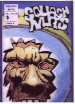
Squash Nuts
Posted: Wednesday, March 7, 2007
By: Steve Saville
 Creator(s): Mark Gray
Publishers: Self Published
From: New Zealand
Price: NZ$ 5.00 plus postage for orders outside New Zealand
‘Squash Nuts’ is Mark Gray’s first [or at least early] entry into the world of small press comics, so first and foremost a warm welcome.
Like most ‘first ups’ it radiates a real enthusiasm and the creator is obviously enjoying doing just that, creating. But also like most ‘first ups’ it does make mistakes and unfortunately in this case the ‘gaffs’ mount up to the extent that they do detract and distract.
A couple of spelling mistakes is no big deal, in fact in many cases add a certain charm to a small press publication but here the spelling error rate goes beyond the occasional, in short it is atrocious. This is not helped by the varying lettering size used which can also irritate. Both of these features combine to alienate a reader who wants to be drawn into the story but is being prevented by poor spelling and lettering.
The cut and paste of the speech and speech balloons is often clumsy and appears to have been done physically which is always hard to get right. The fact that borders around narrative and dialogue are inconsistently used also tends to detract. All of these combine to produce a less than totally satisfying experience.
That is not to say that this Science Fiction tale is not enjoyable, I firmly believe that with a little more care in presentation Gray is on to a winner here. This first instalment starts in outer space with a plot of petty jealousy amongst members of the crew. It moves to Earth[?] where the strange yeti type beast is mysteriously introduced and ends with a ‘shadowy’ character who appears to be up to no good [the dialogue used here makes this character the most believable in the comic], and a taxi driving Middle Eastern despot who have a conversation before ‘shadowy’ man turns into a giant bunny or something. It all gets a little weird too quickly at the end. I need to read part two to see how it all spans out because as I closed the covers on part one I had a sense that it was all starting to spiral out of control.
The layout of many of the pages is very adventurous and shows promise. Gray has gone for the overall visual effect of a whole page rather than concentrate on a frame by frame approach. As a result the pages often look quite dramatic even though the effect is somewhat compromised by a lack of guttering which means the various frames or images do tend to bleed into each other. Page 9 is a real highlight, here the varied use of angles really does help us to identify with the nervous and scared main character.
There is quite a bit that needs tightening up here but you can’t deny the sense of fun present and hey I want to see what happens to bunny man.
In a Word: Spellung.
If you have a comment or question about Small Press then feel free to contact me